Lesson one: Info-graphics (Introduction)
So what did we discover in this first class?
 |
| Statistical infographic about the journey of a tweet. |
Now, when Terry was speaking about info-graphics I thought that they were always in the form of graphs or pie charts conveying scientific information. Wondering why we were being taught about such a thing but I was wrong to assume. An info-graphic is basically information and graphics merged together, obviously you'd worked that one out. By adding a bit of creativity and design, simple information can turn into the poster for a band's world tour, that's an info-graphic in its own way!
Seems like something simple but we were shown how info-graphics are used in our everyday lives. Looking at how the colour scheme's and layouts are done in a particular way to guide us and sometimes influence us. I never thought about it before this class, but ever since I've found myself looking at something simple like a job application form or brochure's given out in the street and analysing them. Looking at how they're put together to influence a certain audience, it's driving me mad but apparently that's a good thing!
How exactly do you make one?
The way I see it, because there's several variations of an info-graphic depending on what you're looking for (or trying to create) that doesn't always mean there's various ways to make one. There's always some simple rules to keep in mind:
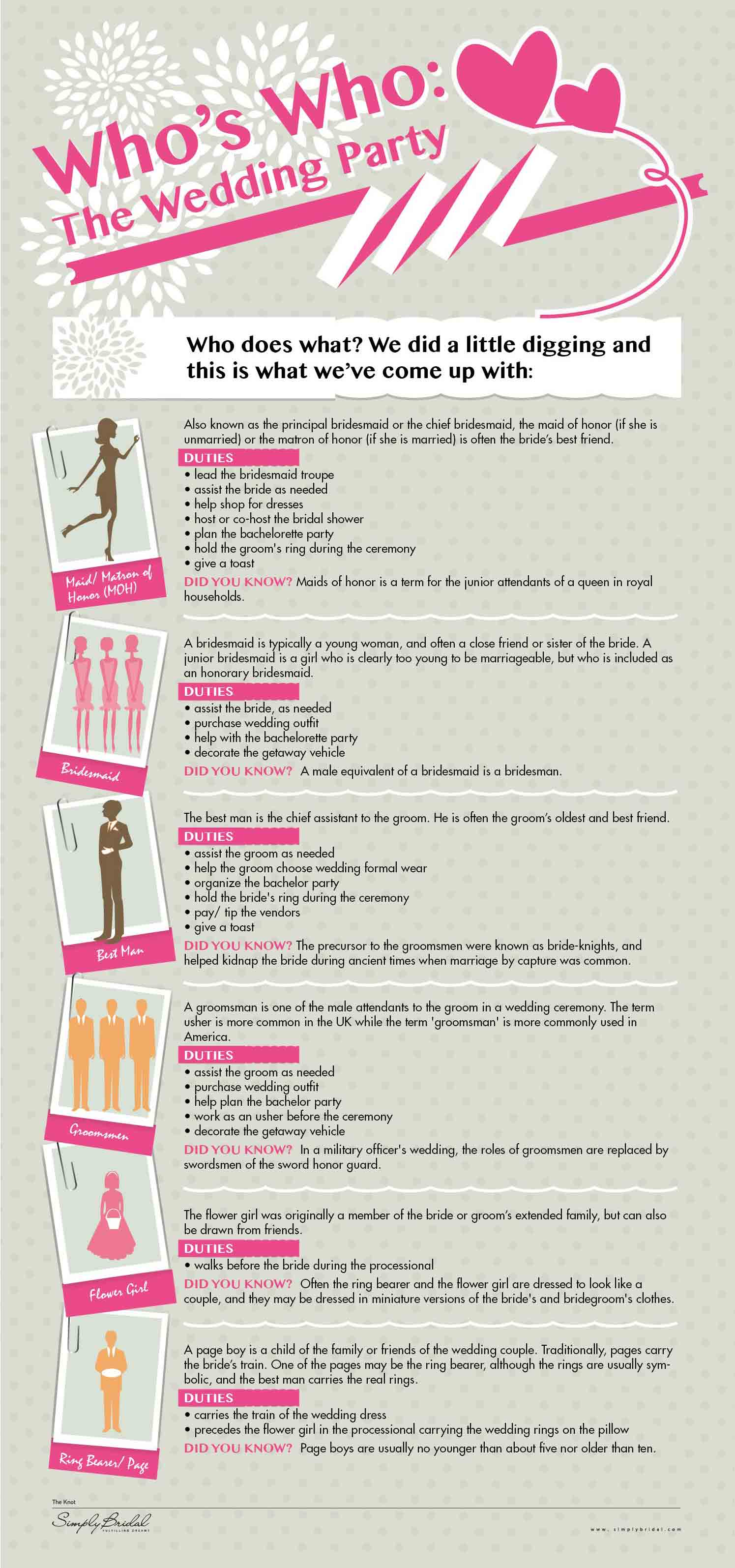 |
| This infographic shows that they're not always statistics, yet still informative! |
Nothing is more important then the actual information going in to your info-graphic. Before you can do anything you need to know what it's going to be about. Ask questions, target your audience, keep asking questions, look up the topic and statistics online, if you need to, but the best information out there is from the people around you! How do you know your infograph will be effective if you don't know people's opinions on the topic you've chosen? You can never have enough research.
Understand your audience!
What good is an infographic when it's not hitting its target audience? You need to have a clear view of what the outcome for your info-graphic is. What do you hope to achieve by creating it? Is it going to inform people of something, is it a comparison of different date? This needs to be clear before you start so that the final result isn't giving a mixed message.
Data before design!
Some people jump right in and start laying out the infographic before they have any information to put in it. That's a recipe for disaster! Before you even consider the design, you need to know what's going in it. You need to think about how much information you're going to have and the topic in general. If you create a layout based on animals, then you later decide your going to do international air travel, you've just designed a layout that's now.. Pretty useless. Start with your data, not the design!
So if you're making your own infographic, remember that it has to be easy to read, easily shared, and easy to use. Otherwise it's not an infographic! They have to be static, interactive and yet informative. This weeks exercise involves using websites to produce 3 infographics of our own. Seems pretty interesting to me, should be fun!
Next week, could be any topic! I can't give you any insight but I'll post what I can when I can.
Until next time. :)